UPDATE 28/2: New screenshot added below
The Blacknight hosting platform is very powerful and has a lot of fantastic features.
However, the control panel is not perfect and we are all too aware of this.
The control panel vendors, Parallels, have been working closely with us to improve aspects of the system so that:
- You are happier
- We are happier
- We all have a more pleasant life
Unfortunately we cannot read people’s minds, so we’re going to be asking YOU, our clients, for feedback on certain aspects of the system in the coming months.
We will do our best to take all the feedback that we receive back to the control panel vendors and get as many of the changes implemented as possible.
One of the areas that we know people have been having issues with is the billing section of the control panel.
We’ve held several conference calls with Parallels and our staff over the last few weeks and they’ve come up with a draft view of how it *could* look moving forward. (NB: there are plans to for an extensive reworking of the billing side of the system in the pipeline, but that could be over 12 months away)
So here is a preview (click to enlarge):
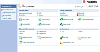
Is it worse?
How could it be improved?
What would you like to see here?
Do you want to see this information in this way?
Is there something on the billing side that isn’t clear (with this screenshot)?
Any and all feedback is welcome, though please try to give us something to work with! Comments like “I hate it” may be valid, but they won’t help us improve it.
You can leave comments here or if you prefer feel free to email management@blacknight.com with your feelings.
Thanks for taking the time to give us feedback – we really do appreciate it.
UPDATE: We have received several very helpful emails from clients with quite detailed feedback. Please keep it coming!
UPDATE 2 – Parallels have made some changes based on feedback from us, you and other clients. They’ve supplied an updated screenshot (click to enlarge):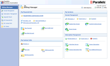
Thanks!
11 Comments
Comments are closed.






A few thoughts on it.
Maybe for most people the number of subscriptions isn’t an issue but I’ve got a few.
It would be nice to be able to name them .. then instead of seeing Subscription 101XXXX I’d actually know what I was looking at.
In a similar vein .. Webspace 101XXX doesn’t mean a hell of a lot for me and I find myself having to figure out which site I’m working on. (Also when further down the line I’m wanting to add a domain to the same webspace as my test setup site or similar I’ve not a clue what the numbers mean)
I’ve mentioned before to management I’d like to be able to create a webspace without having to “create” a domain. This would be a big plus I’d find.
In some places I’m confused by things 😀 .. for example PHP5 support .. run as a CGI application or run as an Apache module.. maybe its something I should know automatically but when I don’t it’d be nice to know which suits my purpose better.
By default on webspace listings I’d like it to be set at 100 (not a big thing but it doesn’t remember my previous selection so a lot of the time I’m having to page between items. In this day of mostly broadband the extra listing shouldn’t take that much longer to load. For example the subscription I’m currently on has 30 items so I’m having to skip to see the next 5)
I think my issues with Auto gen passwords and clicking labels was fixed up (it used remove one item I believe)
Is there a reason I have to go to File Manager and activate it ? Is it an overhead issue or should it not be on by default ?
I’ve just clicked Backup gone to create a backup and its showing a whole load of Webspace http://www.d101XXXXX … which I’ll have to go check to find which one I’m trying to back up
Wonder if these are issues for other people or just me?
James
I raised the subscription nomenclature with Parallels on a call with them a few weeks ago. On my own account, for example, I have several hundred domain names and a wide variety of packages, so being able to do grouping etc., of the subs would make sense.
The webspace ID thing – not sure on this as yet. Paul may be able to shed some light on it
Creating webspaces without domains – I suspect we can change that. We had a very valid reason for not doing it initially, but I think there may be a way around it.
The php version thing – would extra text / description on this help?
Thanks for the feedback
Michele
For the php version thing .. yep a bit of text / tool tip might be handy beside it. Its not a major thing and I can go find out differences between them if I really want to but I’d suspect I’m not the only one who would need to check it up and there are a few other tooltips that would be handy in places (can’t think from the top of my head what they are but similar to the php one .. )
Ok
I’ll have to look into this for you – I know we can put in descriptors and help dialogue text in some screens without hurting any small animals.
First one looks better than the second one.
Like James I think the ability to give webspaces etc sensible names is a big thing. This should be easy enough todo by letting the user enter a description.
I also think this would be good for mysql databases, at the moment the names are not very user friendly.
Other things:
Offsite backup: currently there is no way to download a backup of a site. Would it be that hard to have a backup option that just zips up the website folder?
I think a quick drop down selector in the top menu would be good. It would allow you to quickly select a different webspace/package.
When you create a new email address, with no mailbox and only forwarding, why do you still need to enter a password? Not a big thing this but a bit odd.
If parellels made the cp google gears compatible would this speed up using the interface?
Generally the cp is pretty user friendly, but its always good to improve.
I’m a VPS-only customer, so bare that in mind when considering my points!
The biggest issue I have is, by far, the lack of an alias for VPS instances, as already has been mentioned. It’s crazy that humans are expected to navigate by ID. It’s laughable, in fact. However, it’s clearly obvious that the authors of the software never have to use it, and that goes throughout the system.
Second, is the lack of any data in an invoice as to what it’s for. So if you have 2 VPSes of the same OS/package you need to keep track of the dates manually, or navigate the horrific control panel each time. Again, unheard of in the industry across 9 control panel types I use regularly. Even the aforementioned ID is absent on the invoice.
Thirdly, navigation is a mess. It’s frames based, it’s too many drill down levels for stuff that can easily/usefully be presented on 1 level. Again, that’s a global thing, so no specific examples needed.
Fourthly, renewing is far too complicated. You’ve to drill down too many times (again, having to navigate by ID only), you’ve to add orders, click too many times to add the order (after clicking many times to get there). The process of adding order documents is not explained adequately (and is complete overkill in this context). Having to wait for manual payment checks/processing is not explained adequately. Ordering should be as simple as seeing a list of orders, click renew, review (or change) options, and submit. It’s how it is on every other system I’ve ever used (bar one beta release of a control panel which was quickly reversed).
Fifthly, I still don’t understand why there’s a need to explicitly select a subscription before being able to do anything with it, yet the billing all seems to be 1 layer. Again, it’s overkill. I have 1 account with many subscriptions. This should be presented universally as such, and not as 1 thing in one place (billing) and another thing in another place (VPS management).
Sixthly the 10GB included backup spade is completely worthless. I can’t specify what to backup, so if I use a small percentage of my disk space, a full backup exceeds the 10GB and the service is rendered useless. Not sure if that’s a a business decision or a software oversight.
Seventhly, surely the Help desk can be better integrated? Single sign on, non-conflicting banners, etc. If not, why try and beat it in to the control panel where it doesn’t fit?
Eightly, there are links to pages/services that make no sense in the current context. For example, if I go to edit a domain, I get links to the Blacknight blog in the overview screen (and left navigation frame). That’s not useful.
Ninthly, the blue of the control panel theme looks pretty bad against the “Blacknight green”.
Tenthly, there is an over-complication of navigation everywhere (as already suggested above), especially humongous, useless filters on pages with a handful of options. Things like being able to export the VPS renewal duration list is not useful (to anyone). Needing a search option on a page with 5 items (always 5) is, again, not useful. The overall user experience is extremely poor.
Finally, most of the points seem quite minor, but they all point to the same overall problem. The control panel is overly complex to navigate and be useful; at best. At worst it’s frustrating and business decision factor. It’s certainly been a factor in choosing an Irish VPS provider in my case, but I don’t know if that’s representative.
Of course, with the above critique and loss of business, it must be noted that Blacknight support is brilliant. From routine stuff to pretty specific, very detailed technical issues, it’s all been resolved quickly. That too is a business decision factor, but it’s unfortunate that the control panel takes from that strong point (and that, it does!).
Good luck in getting any of those issues improved upon and increasing customer satisfaction!
Thanks for the detailed feedback
To address some of your points (by number)
1 – We’ve raised this with them. I’m hoping it will be addressed in some fashion, though we don’t know if / when.
2 – I’ll see if we can make any changes to that such as the subscription ID being included. If your first point were addressed we might be able to use the same identifier on the invoice side of it.
3 – We’ve raised this with them. I won’t defend it 🙂
4 – This is being addressed. It’s one of the points that is causing a lot of people headaches.
5 – We’ve raised this with them.
6 – That’s something we control. I’ll discuss this internally and see what we can do. Bear in mind that the backup is compressed, so it will use less space than the full VPS, but we may need to revise the allocations.
7 – There is a reason for this. We have a lot of clients who still aren’t using cp.blacknight.com entirely and our helpdesk has “lived” at support.blacknight.com for several years. We had the option to use the Parallels provided helpdesk, but didn’t really want to when we had one that our support staff were happy with and that our clients were used to. I’ll discuss this and see if we can either integrate it better or make the thing work better. The “sign on” side of it might be a bit of a non-runner in some ways, as not all people have actual logins or even go to the helpdesk in a browser and interact with it entirely via email. In any case we should revisit this.
8 – I’ll have to look at this to see what you mean, but I suspect that they are in a fixed position.
9 – In our current panel or in the screenshot we provided? If it’s the screenshot – that’s just the default colour scheme before applying our custom theming.
10 – I won’t defend that
Thanks for your feedback
Michele
To answer your question on 9) I mean in the existing CP. For example, if I click on Billing after logging in, I get that default blue (same as screenshot above).
Thanks for at least listening to my gripes. Here’s hoping some of them can get sorted!
OK. I’ll see if we can get that fixed.
I know that there’s an odd issue with some of the branding where it seems to vanish on a couple of the screens for some really odd reason.
Thanks for the feedback – it is appreciated
Michele
The screen shots look a little better alright but I think I just dislike those boxes. I would prefer to see big icons and a design/interface that a 5 year old could use..maybe with the most used areas highlighted or some kind of ability to rearrange stuff yourself..