
What’s happening?? When is it happening?
Tuesday the 26th February 2013 we’re going to be upgrading our Control Panel.
It’s going to be happening at 3am to minimise the impact on our customers.
During this time the Control Panel is going to be unavailable at various times.
We’ll be updating our Status Blog with complete details.
What is changing?
With the control panel upgrade there are going to be some changes in the user interface and we hope you’ll like them 🙂
The biggest change for you our end customer’s point of view is that the Control Panel interface is going to be changing.
While we’re limited in some respects as to what we can do with the control panel software we’ve passed along feedback and various changes have been implemented.
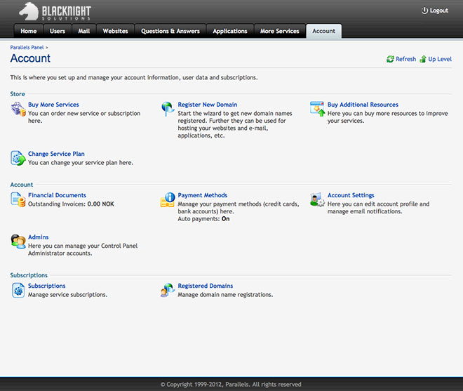
Take a look at the below screenshot. It’s not the final version but you can see immediately that it’s a lot more user friendly and you’re drawn immediately to the icons for various functions within the control panel.
Bear with us during the transition – it might be a big change, but we’re hoping it’s in the right direction!
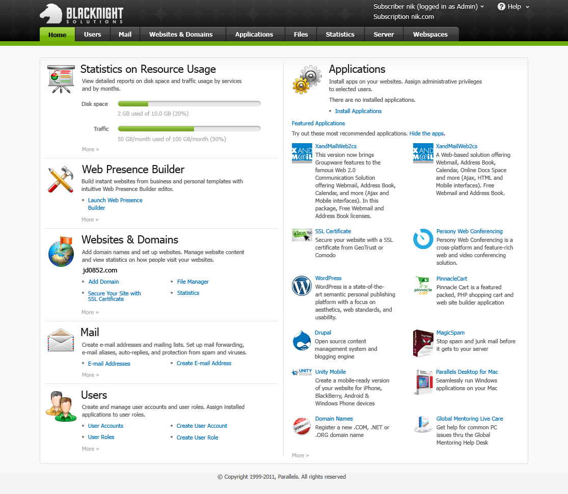
The above image is a representation of how the final version will look. We’ll be tweaking things over the coming weeks so this may change.
There’s a few more screenshots below that display how various aspects and functions within the control panel will look and feel post-upgrade.
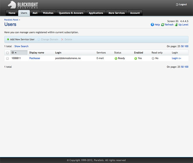
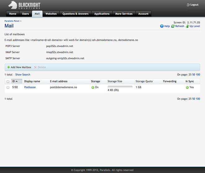
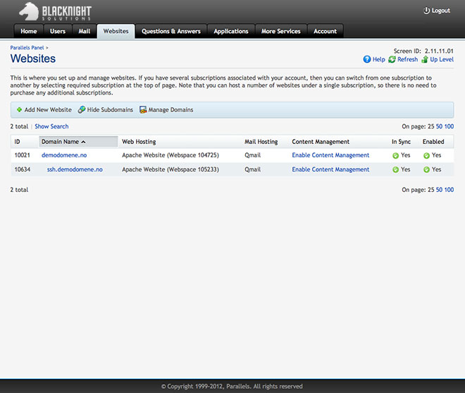
We hope you’re as excited as we are about this
(Original photo: electric shock from BigStockPhoto)

33 Comments
Comments are closed.

Is it going to be new interface? 🙂
Alex Reds screenshots are included in the blog post
Having a catch-all email address setting (like some of your competitors) would be very handy. Can you ask the CP vendor to consider adding that in the future?
Damien, it might be handy. But Catch-all is considered a “thing of the past”. It simply allows spammers to dump tonnes of crap in customers mailboxes. This in turn causes us a lot of headaches and complaints from customers. To be fair it’s main use in the past was so that people could have 1 pop account and have their office mailserver pop it all and deliver it to local mailboxes. With the advent of new tech and offerings this is no longer a requirement.
Ryan Craven liked this on Facebook.
David Kirwan liked this on Facebook.
Ciaran Brogan ?
Tadhg Ryan liked this on Facebook.
looks good! looking forward to it
Patrick Weldon liked this on Facebook.
Once it doesn’t restrict any access that we had before then it’s all good. If it allows more access on shared servers then even better. Make sure you update your faq/knowledge base as all the instructions as to what to click and your videos will be useless without updating them. Good luck
When will you fix/change your webmail client? 🙂
Jouni Johnny Juhola we met with Atmail in Las Vegas a couple of weeks ago and we’re also looking at a few other options.
That’s cool, since now your webmail is just unusable unfortunately :/
You’re using altmail.blacknight.com ?
i tried something you had earlier
can’t remember what.
now i actually just use gmail for all my emails
Aoife Nulty liked this on Facebook.
Wayne Hornby liked this on Facebook.
Sam Dumoulin liked this on Facebook.
Oyedeji Olanike liked this on Facebook.
Eleanor Kelly liked this on Facebook.
Emms Leonard liked this on Facebook.
Róisín Gallagher liked this on Facebook.
Rachel McIlkenny liked this on Facebook.
Well done. I love the nice cool and clean interface. Despite that it is probably the same tech underneath something about the new style is calming and god knows we need calming some days.
Kieran
Very shiny!! Look great guys. Nice to see some updates here. I wish you well and will try not to complain too much 😉
Mike
‘Look’ should have read ‘Looks’ and does not reflect my normal grammatical skills!
Yes, the new interface look beautifiul but why did you remove the facility to access ftp password etc? What benefit is there to that? Why was that done? Users now have to reset passwords every single time instead of being able to access them via there control panel? I am trying to understand why this was done specifically?
Not mad on the new layout to be honest, had just gotten very familiar with the old minimal look, the new look takes up more vertical space. Also a nice feature of being able to view email passwords is gone, now I have no records of email passwords for some of my clients… I would like to this feature enabled on the new system.
I haven’t clicked on every link yet but I like it so far. Looks good and gets you to where you want to be faster.
The new CP is awesome.