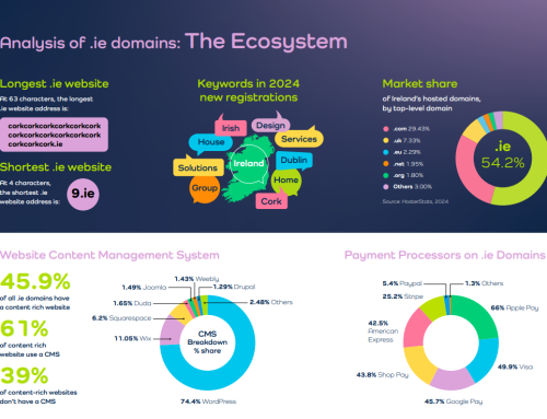
There are now over 1000 new top level domain names “out there”. Some have proven popular. Others have struggled.
That’s to be expected.
The guys over at Nominet, the .uk registry and also backend provider for .blog, released an interesting visualisation of new TLDs earlier today.
Instead of trying to cram every single domain extension into an image they’ve taken the top 250 (based on nTLDStats) and added in a selection of big brand extensions, as well as adding .blog.
Since Nominet are English their choice of visual paradigm is fairly predictable – the London tube map. You can click on the image below and expand it – it’s big enough for most screen resolutions!
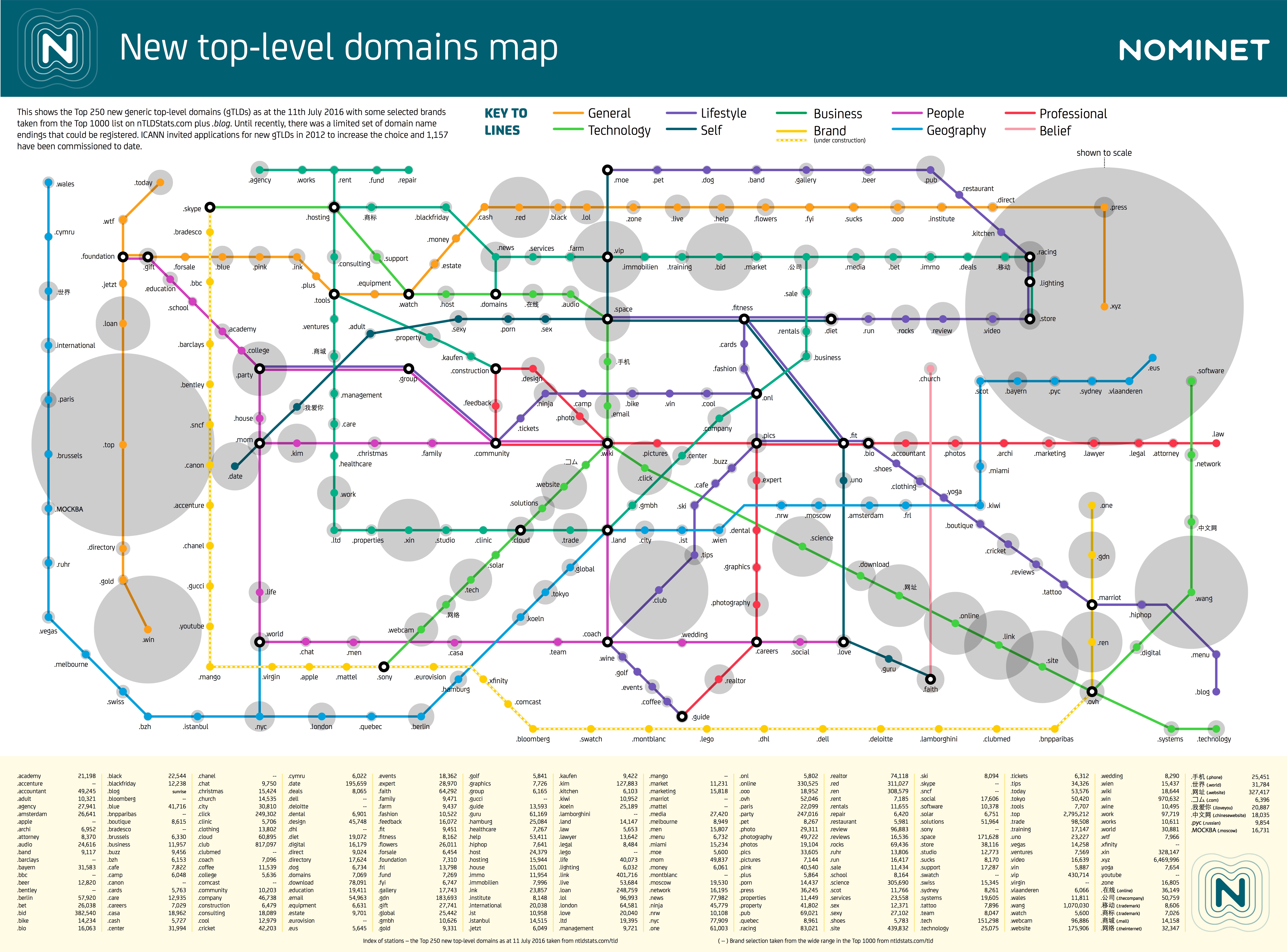
It’s an interesting attempt at visualising the different types of domain extension that are now available out there. I’m not sure if it makes things “simpler” or not for people, but it’s definitely a different way of exploring the options for web addresses.
What do you think? Let us know via the comments.