
One code to rule them all, and on the web bind them…
Web Design used to be simple. Well, simpler. Designers would design to the most popular desktop screen-size, create a single layout that works for pretty much everyone. This was typically a 960px wide Photoshop document which allowed you to easily divide your design into a number of grids, so you could have a cohesive, harmonic, well-laid out page.
So what happened? The buzzing thing in your pocket happened. (or, if you’ve an iPhone, the buzzing thing plugged into a charging dock because who can get a whole day from the damn thing?). Oh, and the tablet happened. And the netbook. And a whole range of devices in-between.
We’ve also changed how we consume the internet. People don’t wait to go home to go online – look around the Luas or the bus next time you’re about. 3G and Wifi means we’re always connected. And when we’re relaxing and watching TV – we’re online too. The web is now our ‘second screen’ for enjoying events through hashtags like #xfactor or #olympics.
Mobile is massive – to take a recent example about 60% of visits to the official Olympics website were via mobile and can’t be ignored by website designers and owners any longer. But how do you cater for a wide range of devices and screen-sizes to work for, with a huge range of capabilities?
Responsive web design.
Where it originated
Responsive web design originated in a blog post on A List Apart by Ethan Marcotte. Rather than rail against the variety of dimensions and capabilities of devices, it seeks to embrace it, by designing for flexibility. It uses fluid (i.e., not fixed size) layouts and images to adapt and reshape the layout of a website based on how it is being viewed.
A great local example is the recently redesigned RTE Player website.
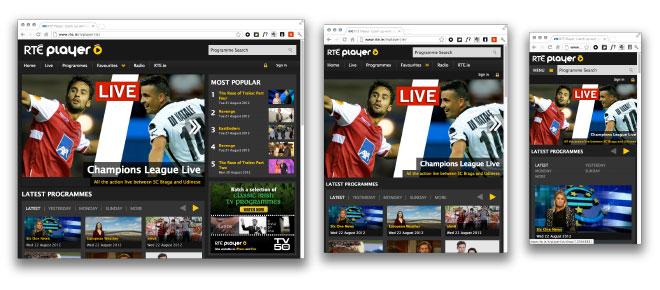
Have a look at it on your desktop, then resize your browser and reduce the width. You’ll see the columns and images getting smaller and smaller, until at a certain point (called a breakpoint) the site switches layout to a single column, with the right column moving underneath. Go very small (the width of a mobile) and the navigation changes from a list to a button called “Menu” that can be clicked (or tapped) to make the menu appear)
This is one of the fundamentals of Responsive Web Design – the content responds to how it is being viewed, expanding, contracting and reordering based on how much room it has. Rather than have the whole site shrunk down and squeezed to fit onto a smartphone screen where you have to do lots of tapping and pinching and swiping, it’s now one single, fluid column.
Why use RWD for your site?
The most obvious reason is simplicity. Rather than having, say, a separate site for mobile visitors (which means two sites to maintain and update) you just need one site that works for both. It’s also future friendly – allowing you to embrace new technologies and progressively enhance your site as time goes on. So, should TV manufacturers all agree to start using TV media queries, you could add an extra stylesheet to take advantage of that.
Google think it’s a good idea
Google’s recommendation for building smartphone-optimised sites is to serve the same url and the same HTML and use just CSS to change how the site is displayed.
But mobile visitors want different things!
Really?
“Mobile users want to see our menu, hours, and delivery number. Desktop users definitely want this 1mb png of someone smiling at a salad.”
— Mat “Wilto” Marquis (@wilto) April 27, 2011
With the huge number of us moving from device to device during the day, the notion of a separate site is becoming a complete PITA. Someone can post a link via Twitter on their phone to a mobile version of a page, but the person opening it on their desktop will get a crappy view. Going the other way around, posting a desktop link can send someone on a mobile into Redirect Hell
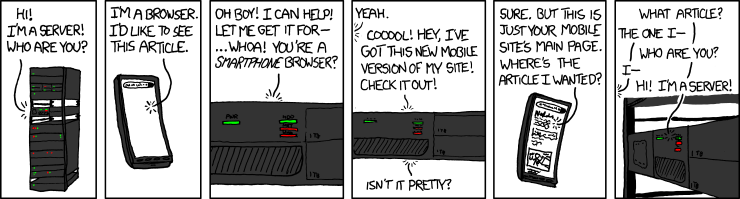
xkcd.com/869/
The simple fact is you should expect people to try and do whatever is possible on your “normal” site on your mobile/tablet/etc. site. There’s a huge number of people who mainly or only access the internet from smartphone, or, if they’re lazy like me, from whatever internet capable device is nearest the couch. One quarter of US & UK mobile internet users rarely or never even use desktops – why exclude them?
(There’s actually a whole approach called Mobile First by Luke Wroblewski that’s too detailed to go into here but well worth reading)
How it works
The layout of web pages are governed by (in a very abstract sense): HTML, which describes what the content *is*; CSS, which describes how the content should *look*; and javascript, which does cool stuff.
Ideally using a “content first” approach, the site is designed to work across multiple devices and screen sizes, adapting and changing depending on the conditions it is being viewed under. This is all done via a recent addition to CSS called Media Queries, which are part of CSS3. Media Queries allow designers to have specific CSS for certain conditions.
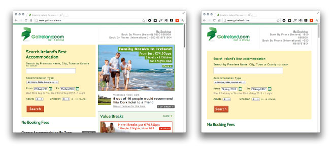
For example, I could say “for screens less than 768px wide, stack everything in a single column” and “for screens greater than 768px wide, use two columns”. This is what the people at Go Ireland have done, presumably to make the site easier to use for mobile devices and tablets.
The layouts themselves are also based on fluid sizes – they aren’t locked down to have say a 420px wide sidebar. This means objects and text can expand and flow dynamically.
Layout changes are just the start of how media queries and responsive design work together. Using CSS and/or javascript, elements such as navigation can be changed from horizontal to vertical lists, then transformed into drop-down selectors. Text can be resized and elements recoloured. The order in which elements are displayed on the page can be changed using content choreography so that, for example, secondary navigation can be moved to the end of a page on mobile devices.
Adaptive Design
What if you’ve already got a website want to use Responsive Web Design to better serve your content to visitors who aren’t on a desktop, but have a very fixed-width site that you don’t want to rebuild from scratch? Or you feel you want/need to have more control over the look of your site and don’t want to go fully fluid?
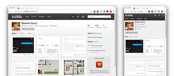
Many sites such as Dribbble.com have taken what’s called an “Adaptive Design” approach. Naming debates aside, Adaptive Design is basically a subset of responsive design, where you have a number of discreet layouts based on fixed breakpoints (sizes). For example, Dribbble.com has two layouts – one for wide viewports, and a simpler one for narrower viewports. Go below a certain size and the layout switches from four columns to two columns, certain tools get removed, and the navigation is simplified.
We’ve taken a similar approach with our own site at woop.ie where there’s three types of layout to cater for mobile, tablet and above screen sizes.
The Challenges
The biggest challenge for web designers and their clients is that you can no longer expect to deliver a few mockups of how a website will look. (Unless you have a ridiculous budget and want to waste it on pictures of your website on a dozen different devices.)
With so many variables in play the design & development approach needs to change to account for greater flexibility. For example, rather than finished designs that show one layout at one size, web designers can create “Style Tiles” – like mood boards or swatches to show look and feel without being hugely prescriptive.
Testing is also a big factor as there’s way more devices to test on. Older browsers (such as older versions of Internet Explorer) can’t use media queries and need to be accommodated, either with a separate stylesheet, javascript polyfills, or other solutions.
Advertising, with its fixed-size islands and banners, also needs to be considered. There’s some good proposals out there (e.g. serve different sized ads at different viewport sizes) but also an opportunity for something a bit more imaginative.
.net magazine have a list of the top responsive web design pitfalls and how to avoid them if you’d like to learn more.

Responsive All the Things!
Obviously there’s a lot more to responsive design than just changing layout. We can go beyond just checking the viewing size of a device and look at the *capabilites* of a device. For example, if I have a web app that uses hover for functionality, I need to change that for touch devices. If I were a picture editor for a newspaper website, I would think about serving different images and crops of images for different sizes, rather than just resizing the same image.
Does the device have a keyboard? Is the visitor on WIFI or a crappy 3G connection? Can I grab their location? Are they moving really fast, are they nearly here? Are they looking at this on a display with eInk, because auto-refresh sucks on that…
Some of these things we can check for, some are being proposed, but responsive design is only getting started.
( Original Images: Icon display tablet and Cell phone – Upset Working from BigStock. )
About the Author: irishstu
31 Comments
Comments are closed.


RT @blacknight: An Introduction to Responsive Web Design: http://t.co/X5wXt2Q5
RT @blacknight: An Introduction to Responsive Web Design: http://t.co/X5wXt2Q5
An Introduction to Responsive Web Design http://t.co/t9wfFkSa – guest post by @irishstu
Want an intro to responsive design? I wrote a bit about it for @blacknight … http://t.co/gUQD1SrN
RT @irishstu: Want an intro to responsive design? I wrote a bit about it for @blacknight … http://t.co/gUQD1SrN
a-men! Even if all you do for mobile customers is bump up the text size 4-6 points, get rid of banners and large BG images and a few other minor tweaks you go a long way to improving the mobile experience. IMO sites shouldn’t need dedicated mobile versions if you do things right.
An Introduction to Responsive Web Design – Blacknight Blog http://t.co/Xlyfo0cd
An Introduction to Responsive Web Design – Blacknight Blog http://t.co/cJ3BCl1Q
RT @blacknight: An Introduction to Responsive Web Design: http://t.co/X5wXt2Q5
RT @irishstu: Want an intro to responsive design? I wrote a bit about it for @blacknight http://t.co/h8MRtqSa
Great blog post Stu! You’ve raised so many good points here about mobile – redirect hell has grown up completely unnecessarily. So glad to hear people are still talking about good web design and user engagement!
P.S. nice direct link to the slideshare slide – works well!
@irishstu Stewart, thanks for your brilliant blog article on @blacknight – http://t.co/qfVMk0bd
@zonua @blacknight wow thanks!
Website owners: You need to think about mobile devices accessing your site. Check @irishstu’s blog: http://t.co/qfVMk0bd
@irishstu @blacknight no, thank-you, it was very informative
An Introduction to Responsive Web Design http://t.co/efimXw9x via @blacknight & @irishstu
RT @irishstu: Want an intro to responsive design? I wrote a bit about it for @blacknight … http://t.co/gUQD1SrN
@irishstu @blacknight Nice into article Mr Curry. The last line is particularly apt. #rwd
Good article on Responsive Web Design with local examples from @irishstu http://t.co/tK7db32K #rwd
@dan_banta @blacknight thanks! between Sass & #RWD web design is getting exciting and challenging again!
Kae Verens liked this on Facebook.
@irishstu @blacknight great article, thanks!
Nice post on Responsive Web Design http://t.co/2VtKGTJq via @blacknight
“One code to rule them all, and on the web bind them” @irishstu on responsive web design http://t.co/iMyvZydo
RT @blacknight: An Introduction to Responsive Web Design http://t.co/t9wfFkSa – guest post by @irishstu
News media pros – you need to get your heads around responsive design – @irishstu has a handy primer: http://t.co/uupPMhfC #beyondprint
Thanks for mentioning the GoIreland design – you’re absolutely correct, we felt a single column layout was more usable for portrait view tablets and for many smartphones so we went with two major breakpoints to accommodate what we felt were common screen widths for those scenarios.
For anyone wanting to design responsively I highly recommend this book:
http://www.abookapart.com/products/responsive-web-design
A few tools, tips and articles I’ve garnered here if anyone’s interested also:
http://delicious.com/frankp/responsive_-_design
Introduction to Responsive Web Design http://t.co/GJxsSNCU http://t.co/uglerSf8
An Introduction to Responsive Web Design http://t.co/NMVC5S08
An Introduction to Responsive Web Design – Blacknight Blog http://t.co/t9wfFkSa
Great article and really nice to see how the responsive approach to web design is spreading.
I’m currently working on a responsive web design gallery to showcase Irish responsive websites, so if anyone has site recommendations or URLs leave a comment and I’ll check them out.